Understanding CSS flexbox
This blog aims at making you understand all the fundamental concepts to have a good command over the CSS Flexbox model in your CSS journey.


CSS flexbox is something really important to master and it's not going away anytime soon. To say it in a one line, you must know ins and outs of how the flexbox works. CSS flexbox helps you create basic and advanced website layouts by enabling the elements adjust their contents to fit various screen sizes. So, fasten your seatbelts for a long way now.

What is Flexbox?
CSS flexbox is a one-dimensional layout pattern which organizes items either in row or column and at the same time controls the spacing and order of the items in the container.
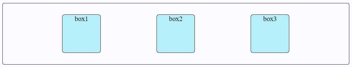
A flexbox container and flexbox items
A flexbox container is the parent element whose display property's value is flex or inline-flex whereas flexbox items are the direct children of a flexbox container. A flex container's children's contents can be shrunk to prevent overflow or expanded to fit the available space.
.flex-container {
  display: flex;
}
The
flexvalue displays the selected container as a block-level flexbox.
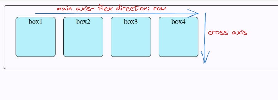
Key flexbox terms
- main-axis: It is based upon the flex-direction along which flex items are laid out. It can be row, row-reverse, column, column-reverse.
- cross-axis: It is perpendicular to the main axis and it depends on the flex-direction of the main axis.
Flex Container Properties
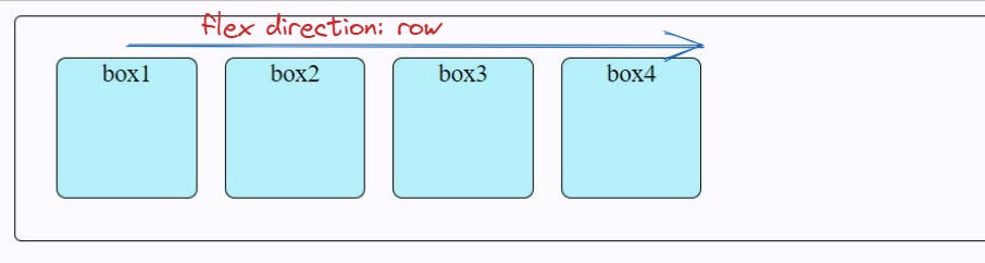
Flex Direction
The flex-direction controls the alignment of items in the container display.
Syntax
.flex-container {
  flex-direction: row | row-reverse | column | column-reverse;
 }
- row: It is the default flex-direction where flex items are stacking horizontally from left to right.
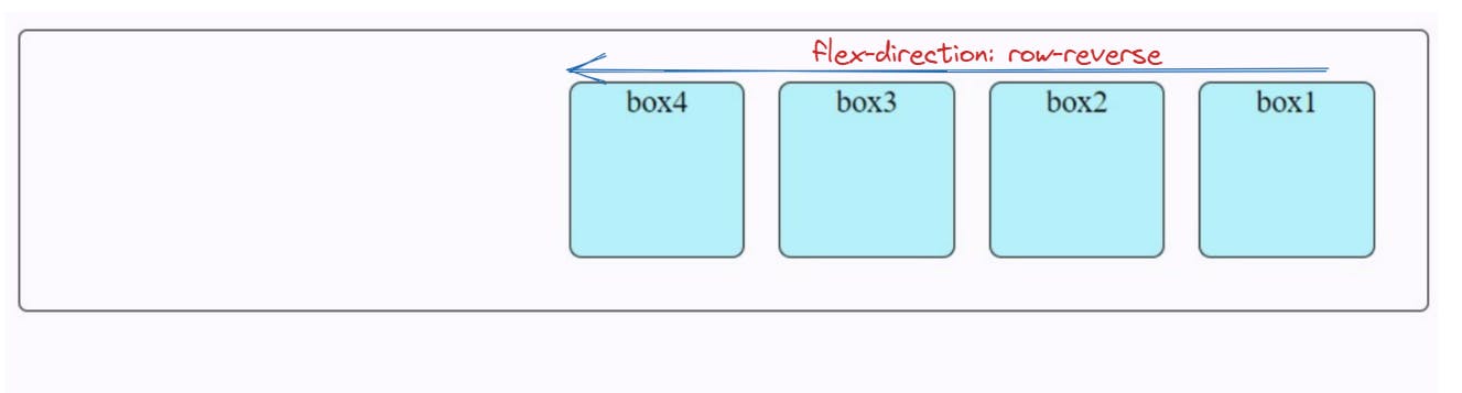
- row-reverse: It is flex-direction where flex items are stacking horizontally from right to left.
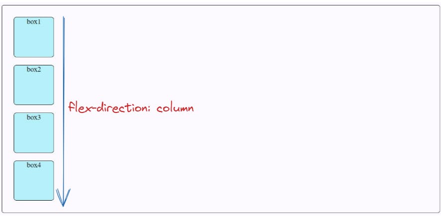
- column: It is the flex-direction where flex items are stacking same as row but from top to bottom.
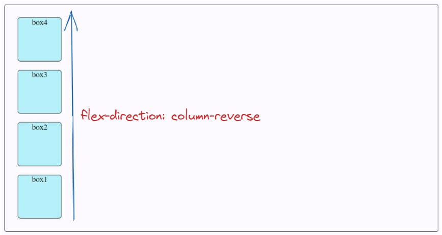
- column-reverse: It is the flex-direction where flex items are stacking same as row-reverse but from bottom to top.
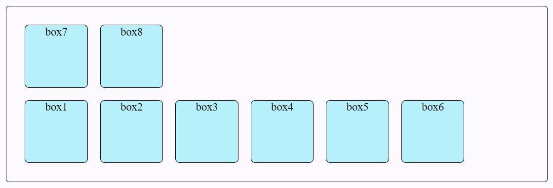
Flex-Wrap
The flex-wrap property specifies whether the browser should force overflowed elements into a single line or wrap onto multiple lines.
Syntax
.flex-container {
  flex-wrap: nowrap | wrap | wrap-reverse;
}
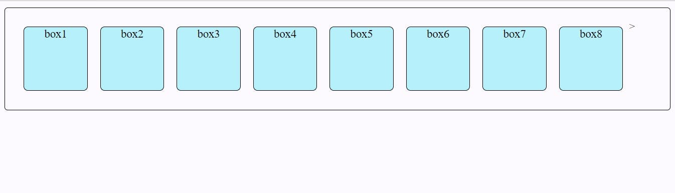
- nowrap: It will not push the flex items to multiple lines and will wrap it in a single line which may cause the flex container to overflow. It is the default flex-wrap property.
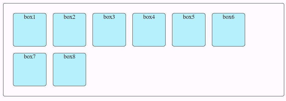
- wrap: If necessary, it lays out the overflown flex items in multiple lines.
- wrap-reverse: It wraps the flex items same as a wrap but in the reverse order.
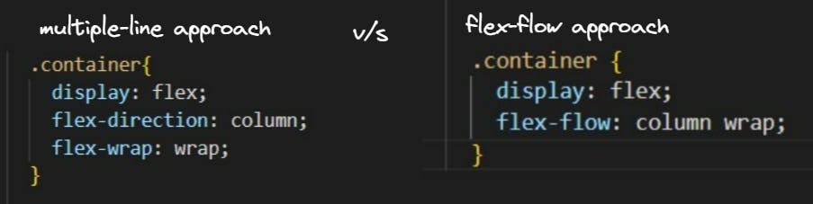
Flex-Flow
Instead of writing multiple line of code, we can the flex-flow shorthand property. It helps to set the flex-direction and flex-wrap properties.
- For example, to set the flex-direction to column and allow flex items to wrap, we can write it in both ways given below.
Justify-Content
The justify-content property distributes space between flex items along the main-axis (horizontally).
Syntax
.flex-container {
   justify-content: flex-start | flex-end | center | space-between | space-around | space-evenly | start | end | left ;
  }
- flex-start: It is the default value that aligns the flex-items from the start of the flex-direction.
.flex-container { display: flex;
  flex-direction: row;
  justify-content: flex-start;
}
- flex-end: It aligns the flex-items from the end of the flex-direction.
.flex-container { display: flex;
  flex-direction: row;
  justify-content: flex-end;
}
- center: It aligns the flex-items at center along the flex-direction.
.flex-container { display: flex;
  flex-direction: row;
  justify-content: center;
}
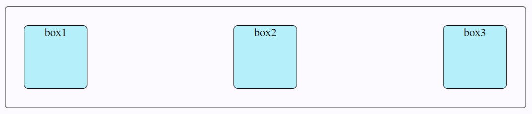
- space-between: It aligns the flex-items evenly distributed where the first item is pushed to start, and the last item is pushed to end.
.flex-container { display: flex;
  flex-direction: row;
  justify-content: space-between;
}
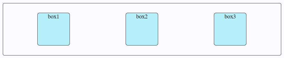
- space-around: It aligns the flex-items evenly distributed with equal space around them.
.flex-container { display: flex;
  flex-direction: row;
  justify-content: space-around;
}
- space-evenly: It aligns the flex-items with evenly space around them.
.flex-container { display: flex;
  flex-direction: row;
  justify-content: space-evenly;
}
Align-Items
The align-items property distributes space between flex items within the flex-line along the cross-axis (vertically).
Note: A flex line is each row or column of flex items in a flex container.
Syntax
.flex-container {
   align-items: stretch | flex-start | flex-end | center | baseline;
  }
- stretch: It is the default value that stretches the flex-items to fill the cross-axis.
.flex-container { display: flex;
  align-items: flex-stretch;
}
- flex-start: It will align the flex-items with the cross-start edge of the cross-axis.
.flex-container { display: flex;
  align-items: flex-start;
}
- flex-center: It will align the flex-items to the center of the cross-axis.
.flex-container { display: flex;
  align-items: center;
}
- flex-end: It will align the flex-items with the cross-end edge at the end of the cross-axis.
.flex-container { display: flex;
  align-items: flex-end;
}
- baseline: It will align the flex-items with the baseline of the cross-axis.
.flex-container { display: flex;
  align-items: baseline;
}
Align-Content
Do you remember when you read about what is flex line in the introduction of the align-item property. It will help you understand that align-content property and align-item property look somewhat similar, but they are different in the context of flex line.
The align-content property aligns the flex-items with only multiple flex lines on the cross axis and will have no effect on a single flex-line container where flex-wrap is set to its default value, no-wrap.
Syntax
.flex-container {
   align-content: stretch | flex-start | flex-end | center | stretch | space-around | space-between;
   }
- stretch: It is the default value that stretches the flex lines to fill the cross-axis.
.flex-container { display: flex;
  align-content: flex-stretch;
  flex-wrap: wrap;
}
- flex-start: It will align the flex lines with the cross-start edge of the cross-axis.
.flex-container { display: flex;
  align-content: flex-start;
  flex-wrap: wrap;
}
- flex-center: It will align the flex lines to the center of the cross-axis.
.flex-container { display: flex;
  align-content: center;
  flex-wrap: wrap;
}
- flex-end: It will align the flex lines with the cross-end edge at the end of the cross-axis.
.flex-container { display: flex;
  align-content: flex-end;
  flex-wrap: wrap;
}
Gap, Row-Gap, Column-Gap
The gap property applies space only between flex items not on the outer edges.
Row-Gap: It applies space between the rows of the container.
Column-Gap: It applies space between the rows of the container.
Flex Item Properties
We use flex item properties when we want to specifically layout a flex item in the container. So, that means, we apply a flex item's property on the flex item and not its container.
Align-Self
It aligns the only selected flex-item and not all the flex-items. This property overrides the align-items property.
.flex-container {
   align-self: stretch | flex-start | flex-end | center | stretch | baseline;
   }
Among all the values we'll try one example of
stretchvalue.
Order
This property allows you to control the order of the flex items without changing the HTML code. However, it is not recommended to use this property since it creates the accessibility issues for the screen readers.
Flex-Grow
The flex-grow property defines how much of the flexbox's left-over space a flex box item will be allocated relative to the rest of the flex items. The default value of flex-grow is 0.
Flex-Shrink
The flex-shrink property defines how much the flex item will shrink relative to the rest of the flex items. The default value of flex-grow is 1.
Flex-Basis
The flex-basis property sets the initial size of the flex item along the main axis of the flex container. The default value of flex-basis is auto. The browser gives the higher priority to flex basis than the height, width defined of flex item.
Flex
The flex property is a shorthand for the flex-grow, flex-shrink, and flex-basis properties.
flex: flex-grow, flex-shrink, flex-basis;
Conclusion
We've covered all the CSS flexbox properties you need to create basic and advanced website layouts in flexible and responsive ways. The next step is practice with fun😁! Just click on the below link to play the Flexbox Froggy Game.
Thanks for reading! I hope this article on flexbox was helpful to you. 🤓