How learning CSS Grid Layout would be helpful?
This article will cover CSS-Grid properties and the ease it provides. We'll also cover how it is different from the flex property.

Software Developer
When the CSS layout models GRID and Flexbox were not introduced, there were a lot of container alignment issues for developers, who had to write a block and size them along with using positions. It was a nerve wrecking task of hours. I expect here that you have a basic understanding of flex box and how it also makes life easy before I move ahead to explain the difference between the CSS grid model and the CSS flexbox model. If you're not familiar with the flex box model, please refer the article link Understanding CSS flexbox that I have written on CSS flexbox.
What is CSS Grid layout?
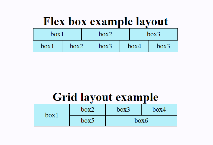
CSS Grid comes very handy while making simple and complex layouts where the items in the grid container are arranged in two dimensions both horizontally and vertically. We can create the layout by defining the grid container's property and grid item's property which will be discussed later. We can visualize its layout like an excel sheet, a photo gallery. On the other hand, if we talk about flexbox, it is also helpful in aligning the items but is limited to only one-dimensional arrangement of items either horizontally or vertically and its layout is just like a nav bar on top of a webpage. Let us have a look at the picture below where we can easily recognize the differentiation between both.
A grid container and grid items
When we define any element as a grid container using display property with value grid, the elements nested inside become grid items and can often represent a header, sidebar, footer or similar layout component according to our design.
.grid-container {
  display: grid;
}
The
gridvalue displays the selected container as a block-level grid.
Grid Container Properties
Grid-Template-Column & Grid-Template-Row
Grid-Template-Column is used to define number and width of columns. Grid-Template-Row is to define number and height of rows.
Syntax
.grid-container{
  grid-template-columns : 80px 100px 150px;
  grid-template-rows : 100px 100px;
}
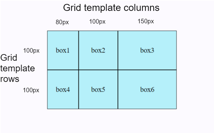
In the above syntax, we have given the value width individually to all three columns and rows.
.grid-container{
  grid-template-columns : 1fr 1fr 1fr ;
  grid-template-rows : 1fr 1fr;
          // OR
  grid-template-columns : repeat(3, 1fr) ;
  grid-template-rows : repeat(2, 1fr) ;
}
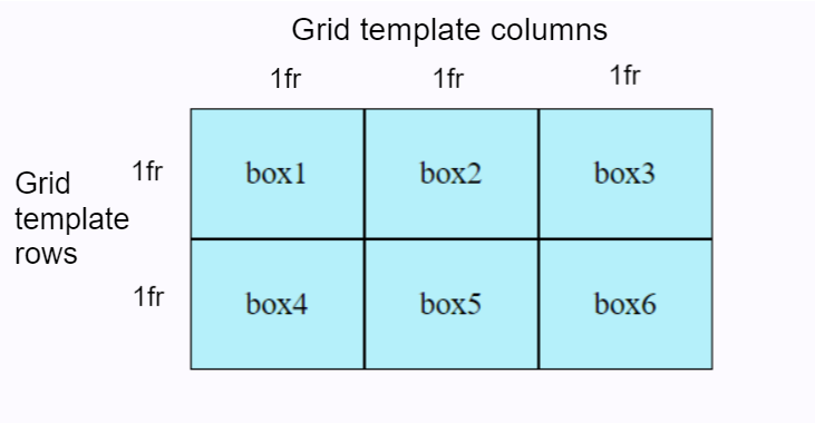
In the above syntax, we have used fr unit in the values. Fr stands for a fractional unit and 1fr means one part of the available space in the grid container. It serves the distribution purpose of the space. Instead of '1fr 1fr 1fr' for 3 columns/rows, we can use the repeat() notation if they're all going to be of one size.
Row-Gap & Column-Gap
The default gap value of row and column is 0.
The column-gap property is used to provide gap between columns inside the grid container. The row-gap property is used to provide gap between rows inside the grid container.
Syntax
.grid-container{
  display: grid;
  grid-template-columns : repeat(3, 1fr) ;
  grid-template-rows : repeat(3, 1fr) ;
  row-gap: 20px;
  column-gap: 5px;
}
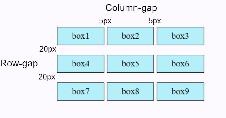
From the above image, we can see that a gap of 5px was set for the columns and 20px for the rows of the grid container making them equally spaced.
Justify-Content property
The justify-content property distributes space between grid items along the row axis, horizontally in a grid container.
Syntax
.grid-container {
   justify-content: start | end | center | space-between | space-around | space-evenly;
  }
We will try an example of value: space-between to check how this property works.
Align-Content property
The align-content property distributes space between grid items along the column axis, vertically in a grid container.
Syntax
.grid-container {
   align-content: stretch | flex-start | flex-end | center | stretch | space-around | space-between;
   }
Here, we will use the same value space-between as previously tried on justify-content property.
Grid Item Properties
Grid-Column property
It is a shorthand of grid-column-start & grid-column-end. We can join number of columns together here. It's time we follow the syntax of it and try with values for item1 to fit it into three columns, increase its width.
Syntax
grid-column: grid-column-start / grid-column-end;
.one{
  grid-column: 1/4;
        OR
  grid-column-start:1;
  grid-column-end:4;
}
Grid-Row property
It is a shorthand of grid-row-start & grid-row-end. We can join number of rows together here. We will try this with second item to fit it into till its next row, increase its height.
Syntax
grid-row: grid-row-start / grid-row-end;
.two{
  grid-row: 2/4;
        OR
  grid-row-start:2;
  grid-row-end:4;
}
Justify-Self property
It aligns the position of the selected grid item along its cell's row (inline) axis.
Syntax
justify-self: start/center/end/stretch;
.two{
  grid-row: 2/4;
  justify-self: center;
}
We will place the second item to center of its cell's row axis.
Align-Self property
It aligns the position of the selected grid item along its cell's column (block) axis.
Syntax
align-self: start/center/end/stretch;
.five{
    align-self: center;
}
In the below code, the fifth item will be aligned to center of its cell's column axis.
Grid-Area property
A grid-area-property is a shorthand short-hand property for the grid-column-start, grid-column-end, grid-row-start, and grid-row-end properties. It specifies the size of a grid item and its location within a grid container.
Syntax
.grid-item {
  grid-area: grid-row-start / grid-column-start / grid-row-end / grid-column-end;
}
.one {
  grid-area: 1 / 1 / 1 / span 3;
}
The grid-area property is also used to assign a name to a grid item. which can be used in a grid-template-area property of a container. Cool technique? We can practically see where our layout components like Header, Sidebar, Main Content & Footer are in the entire layout of our webpage.
Now, let's see how the grid-template-area property works.
Grid-Template-Area property & Grid-Area property
The grid-template-area property specifies the area where we want to place named grid items within a grid container.
Syntax
grid-template-areas = none | <string>+
Note some key points
none: It is the default value and it does not contain grid named areas and the size of grid items are simply determined according to the size of the container.
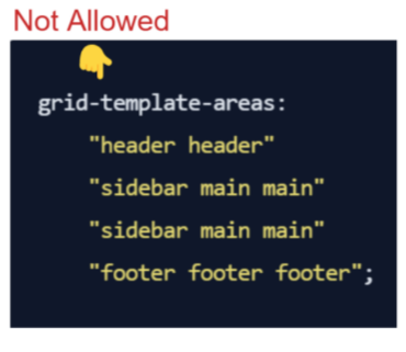
<string>+: This type of value contains the row with grid item name surrounded by either double"or single'quotes. Just like this: "header header header". We repeat the name header span tracks separated by a space.No empty cells allowed: All the values must describe a complete grid with no empty cells. It is not allowed that we create the header section with two columns only "header header" and remaining rows with three columns. It won't work.
- Gaps can be created: We can create gaps for an empty cell in the grid with a character
.dot notation. We can also use a series of dot notations.......... Both will return the same output.
- Only rectangular areas allowed: We cannot create non-rectangular areas (such as T-shaped or L-shaped).
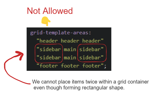
We have to take a note from the above image that we can only define each area once, which means we can’t copy it into two places on the grid. I hope, it makes sense now.
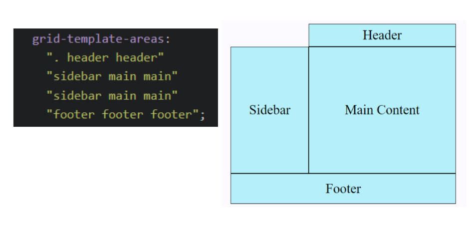
All the rules that we have discussed are important and must be followed in order to have an amazing layout for our webpage. Enough of rules, now we will create a simple layout for a webpage using the grid-template-area property and grid-area property.
grid-template-areas:
    "header header header"
    "sidebar main main"
    "sidebar main main"
    "footer footer footer";

    .header{
  grid-area: header;
}

.sidebar{
  grid-area: sidebar;
}

.maincontent{
  grid-area: main;
}

.footer{
  grid-area: footer;
}
Summary
In CSS, Grid is a very comprehensive subject and I think, we have covered almost all the essential parts of it right from the starting how grid and flex are different and can be preferred to use according to their requirements. In a nutshell, we can say that Grid makes our life easy, we can create simple to complex designed layouts like calculator interface, chess board design, photo gallery layout and many more such in a very easy manner if we have practiced enough about how the grid properties work.
We cannot conclude without giving a shoutout to you. You deserve this. 😁

Want to practice and learn more about GRID?
Just play with all the properties, click on this GRID GARDEN game link.
I hope you've found this article helpful. Please feel free to share your thoughts by leaving a comment below. Thank you for reading, everyone! 🤓


